A Case Study on Rebranding and Landing Page Redesign for Zilliqa, a Blockchain Company, Including Research

-
Research, UX, UI, Branding
-
Figma
Photoshop
AfterEffects
Zilliqa, a blockchain company, needed a fresh look and user-friendly website to attract and engage stakeholders. I conducted extensive research to develop a new brand identity and landing page design that are innovative, accessible, and trustworthy.
The result is a successful rebranding and landing page redesign that better represents the company's vision and mission. This case study showcases the process, research findings, design decisions, and the final outcome.
The research was conducted to understand Zilliqa's target audience, competitors, branding, and potential areas for improvement in terms of visual design, user experience, and tone of voice.


The outcome of the research and competitor analysis is a clear understanding of the market, Zilliqa's position within it, and the strengths and weaknesses of its competitors.
Zilliqa's unique value proposition is empowering ordinary users to understand and explore the world of Web3 through the inclusive approach.
The competitor analysis helped understand the current market landscape for blockchain technology and the position of Zilliqa in it. By studying its competitors, the strengths, weaknesses, opportunities, and threats of Zilliqa were determined.
Research recap
I suggested creating a logo that is modern, innovative, and memorable. The design was to reflect Zilliqa's position as a leading player in the blockchain space and its focus on unlocking the potential of Web3.
Logo and Overall Rebranding
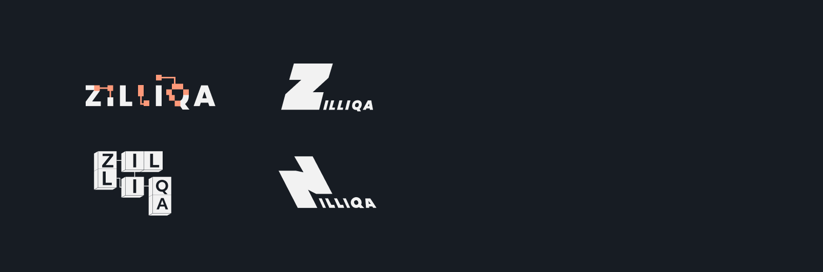

The chosen version features interconnected blocks with letters inside, symbolizing the blockchain technology and smart contracts at the core of the company's offerings.
The blocks and lines create a visual representation of the secure and connected nature of Zilliqa's solutions, conveying the company's mission to facilitate decentralised transactions and empower users through its blockchain protocol.
The typography for the letters inside the blocksare in a bold and modern sans-serif font, conveying a sense of confidence and forward-thinking.
The tone of voice for Zilliqa is confident, professional, and approachable. Emphasize the company's trustworthiness and its commitment to innovation, while also making sure to communicate the accessibility of Zilliqa's products and services.
This tone should instill confidence in users and show them that Zilliqa is a leader in the blockchain space, committed to delivering cutting-edge solutions that are accessible and easy to use.

Brand voice
The heading font, Area Normal, is sleek and modern, while the body font is easy to read.
The accent font, Cardo cursive, adds a touch of elegance and reinforces the overall friendly vibe. The chosen fonts complement the overall design while avoiding a corporate feel.

Fonts + Colors
The color palette is ink black for the dark mode, pastel white for the light mode, and a vibrant orange as the accent color that strikes a balance between pastel and neon tones.
The color scheme represents trustworthiness, innovation, and accessibility, the tone of voice for Zilliqa.
The imagery choice is custom made 3D hyper-realistic cubes.
The visual representation of the cubes creates a sense of innovation and cutting-edge technology, showcasing Zilliqa's focus on being a reliable and accessible solution in the world of blockchain and decentralized apps.
The cubes are rendered in a hyper-realistic style, which adds a touch of sophistication and reinforces the idea of Zilliqa as a trusted and reliable partner for businesses and individuals.
Imagery & visuals

By incorporating innovative and interactive elements, the redesigned page presents a modern and sophisticated image, while also providing an intuitive and user-friendly interface. Additionally, the changes were based on research to better understand the needs and preferences of the target audience and to create a page that effectively showcases the unique features and benefits of Zilliqa.
Landing UX
To enhance the user experience on the landing page, I made several key changes.
I added a dark/light mode option for users to choose from (when lending on the page the mode can be chosen automaticly based on users system preferences), a language switch for increased accessibility, a search bar for easier navigation, a FAQ and tutorials section in the footer, “enterprise” tab in nav bar, rearranged the blocks for better organization and added subheadings for better engagement.
Landing UI
Last but not least was creating a teaser video with empowering quotes and visuals to excite and engage the audience and to present a new style.
Short and impactful clips give a glimpse into the world of Zilliqa and what it has to offer. It's a fun way to showcase the innovative and accessible side of the platform.
Teaser